
Overview
Pantsuit Professionals is a web service that is made for women. Their overall goals are to help women of all colors and age's climb up the professional latter, while helping them with their networking. Pantsuit Professionals offers a variety of services from lifestyle blogs, to events people can attend, and to a job board where women can apply for jobs.
I was ready for all the challenges that the website had with their UX and UI. I was confident in solving problems and creating a better user experience. What I worked on first was designing a few pages and modernizing the UI and then creating a design system for the whole team so we can all be on the same page.
After that I did some Competitive Analysis on other websites that offered similar services as Pantsuit Professionals. I went through the user flow of the Pantsuit Professionals website to make sure that the flow was good and that everything made sense. I conducted some user research on the membership directory with Hiring Managers to figure out if there was any problems with the design and to see if the design meet business goals and there were.
Duration
My Role
Team
Tools
My Design Process

User Audience
Pantsuit Professional's audience are Women from ALL ages and demographics. This is an organization that wants to help ALL women climb the latter of their professional career by networking with other woman, reading on financial topics, managing their money, and reading blogs on other topics that are posted on the website.
My roles and responsibilities
My role and responsibilities in this project was to do the User Research, create user flows, sketch ideas, make the hi-fidelity prototypes and conduct usability testing to make sure the new designs meet business and user goals.
Project Scope and Constraints
I designed this hi-fidelity prototype in ONE week after conducting user research. I had to be quick so that we could conduct user testing as soon as possible, and so that then we could hand over the design to the developers.
Some constraints that I had were conducting User Research with hiring managers and recruiters because of the money budget that the company had. I also had to manually find hiring managers or recruiters who were willing to help me with my user research.
Original Page
Here are two original pages. The first one is the dashboard for a users profile and the second is the membership directory.


Research
I ran some usability testing sessions on the designs that were already made and these were the problems I found that Users had.
Problems with Profile dashboard
Membership Directory Research
Key takeaway of problems with Membership Directory
Goals
User flow
This is the userflow for the membership directory.

Sketches

Final Design

With my solution I added Information Architecture which made it easier for recruiters and hiring managers to find a person that they would be interested in contacting for a role.
I created a side bar to let users navigate to any page they wanted.
I added the person's top 3 most relevant job experiences with the dates so that recruiters could see a person's experience right from the bat, because if it was like the original design recruiters would have to click on every profile to know more about the person's experience and this very time consuming.
I added a filter which lets hiring managers and recruiters filter by people who are looking for jobs or internships.
There was also no pagination on the original design so I implemented that into the design because it wasn't clear how it would have been without pagination.
I was also able to complete my goals that I talked about earlier, which were to merge the membership directory into the profile dashboard, while making the navigation seamless, adding better information architecture, and making the membership directory easier to navigate.
Usability Testing
I tested the new designs with 5 recruiters and the data and feedback was a lot more positive. All Recruiters were able to find people who were looking for new jobs and roles in an average time of 1:20 seconds compared to 5 minutes or more from previous designs.
Recruiters said that these new designs were a lot more better because it was easier to find people who were on a job search and also because this time they would click on people who they thought had enough experience for the role because of the information that was displayed on the cards. This way they did not have to click on every single profile just to know a little more about the persons experience.
Results and Learnings
The results were that the website was a lot more easier to navigate. Information was more clear and the membership directory saved recruiters a lot more time because they did not have to click on every single profile to view more information of a persons profile. The filter was also a good addition because it helped recruiters and hiring managers find people who were looking for a specific role as "internships" or "full time jobs".
What I learned was that it's always the best to try and conduct user testing. Because of money budget I was going to design something else because the company did not have a budget for user research on this page but I was able to convince the company to conduct user research because it would save time and more importantly money!
View Next Project
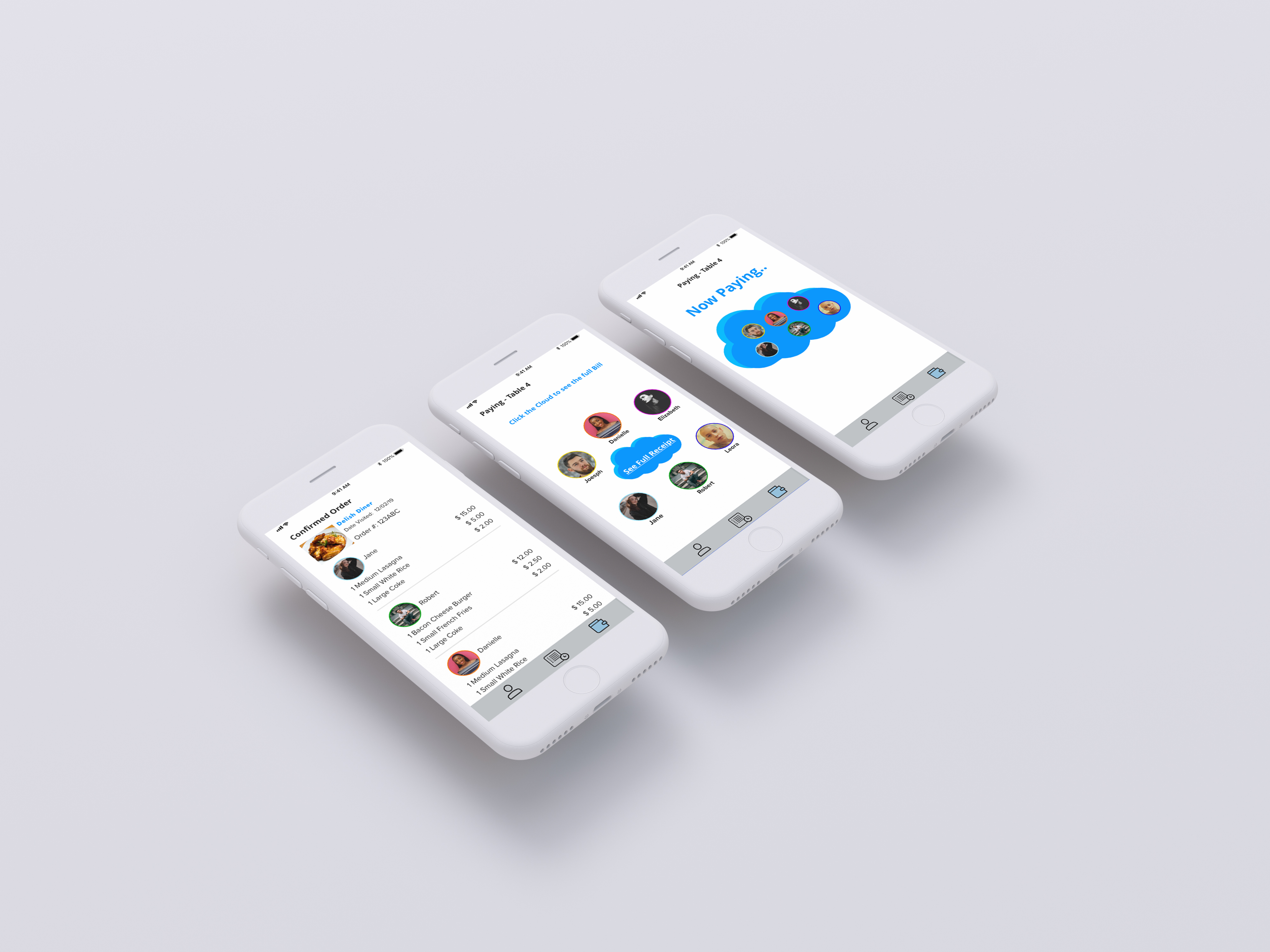
PayCloud
Restaurant Payment Service | January - March 2020
Designing an app that makes the experience of splitting a bill at a restaurant easy.
View Case Study